Your thumbnail is doing more of the click-work than your title, and most creators spend the time the other way around. A thumbnail is a decision a viewer makes in a fraction of a second, while scrolling, on a phone, surrounded by other thumbnails. The first one you make has one job: be instantly readable in that half-second, with one idea and nothing competing.
Skip the thought and you get a busy, low-contrast thumbnail that disappears in the feed. It is not that it looks bad up close. It is that it vanishes at the size it actually appears, which is small, beside a dozen others, in front of a viewer who is not really looking yet.
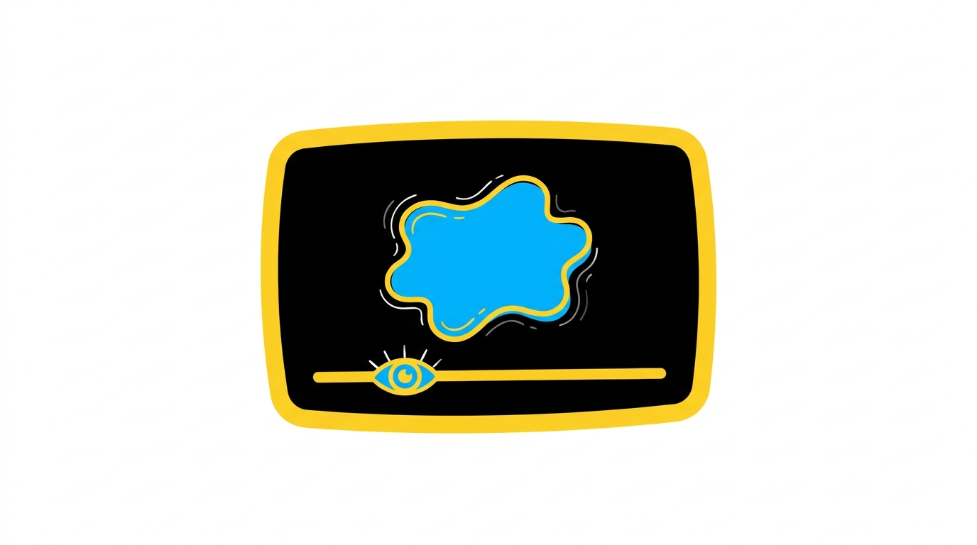
One focal point, nothing fighting it
The most common thumbnail mistake is cramming. Three ideas, four objects, a paragraph of text, and the eye bounces off all of it. A strong thumbnail has one focal point, one thing the eye lands on, and gives it room. If you cannot say in three words what the focal point is, it has too many.
Build the rest around protecting that focal point. Empty space is not wasted space; it is what makes the one thing stand out. Crowding is what makes a thumbnail look cheap and read as noise.
Contrast is what survives shrinking
High contrast keeps a thumbnail legible when it is small. A bright subject against a darker background, or a clear shape against a clean field, reads at any size. Low-contrast thumbnails, subject and background at similar brightness, turn into mush the moment they shrink, which is the only size that matters.
If you use a face, make the expression strong and clear; a subtle one is invisible at thumbnail size. If you use text, a few large words at most, big enough to read on a phone without squinting. Most of the time the image should carry it and the title handles the words.
The half-shut eyes test
The quick check: look at your thumbnail and half-close your eyes, or step back from the screen. If you can still tell what it is, it works. If it blurs into an indistinct blob, the contrast is too low or the focal point is too busy. That mimics how a scrolling viewer actually sees it: a quick, low-resolution glance, not a careful study.
Do this on your phone, not your monitor. A thumbnail that looks great on a big bright screen can fall apart on the small one where the decision actually happens. Judge it where it lives.
Where Chewbr fits
Make thumbnail one is step 20 of the 47, the first Package step. Thumbnails get three steps in the workflow, more than any other single task, because packaging is where a finished video either gets clicked or gets scrolled past, and the thumbnail leads that.
Keep reading
One is not enough: make a second, different thumbnail so you have a real choice. Both get judged in the shrink test, and which to actually publish is covered in why your second-best thumbnail is usually the one to publish.